Menu
Implementation code
Wrap your app.js code with PortalProvider component to use menu.
import { PortalProvider, NativeProvider } from '@nexara/nativeflow';
import Component from './path';

const App = () => {
    return (
        <NativeProvider>
            <PortalProvider>
                <Component/>
            </PortalProvider>
        </NativeProvider>
    )
}
export default App;
- Internally controlled checkbox
import { Menu, MenuItem, MenuItemLabel, Divider } from '@nexara/nativeflow';
import { EllipsisVertical, Share2, User, Download, Eye } from 'lucide-react-native';
const Component = () => {
return (
<Menu
anchor={<EllipsisVertical color='#000' size={moderateScale(22)} />}
onSelect={(e) => console.log('select', e)}
placement='top'
>
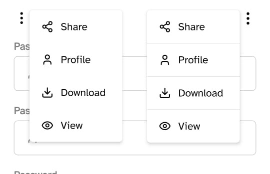
<MenuItem name='Share' onPress={() => console.log("okk")}>
<Share2 color='#000' size={moderateScale(17)} />
<MenuItemLabel>
Share
</MenuItemLabel>
</MenuItem>
<Divider/>
<MenuItem name='Profile'>
<User color='#000' size={moderateScale(17)} />
<MenuItemLabel>
Profile
</MenuItemLabel>
</MenuItem>
<MenuItem name='Download'>
<Download color='#000' size={moderateScale(17)} />
<MenuItemLabel>
Download
</MenuItemLabel>
</MenuItem>
<MenuItem name='View'>
<Eye color='#000' size={moderateScale(17)} />
<MenuItemLabel>
View
</MenuItemLabel>
</MenuItem>
</Menu>
);
}
export default Component;
- Externally controlled checkbox
import React,{ useState } from 'react';
import { Menu, MenuItem, MenuItemLabel, Divider } from '@nexara/nativeflow';
import { EllipsisVertical, Share2, User, Download, Eye } from 'lucide-react-native';

const Component = () => {

    const [isOpen, setIsOpen] = useState(false);

    return (
        <Menu
            anchor={<EllipsisVertical color='#000' size={moderateScale(22)} />}
            onSelect={(e) => console.log('select', e)}
            placement='top'
            disableBuiltInState
            isOpen={isOpen}
            onRequestOpen={() => useState(true)}
            onRequestClose={() => useState(false)}
        >
            <MenuItem name='Share' onPress={() => console.log("okk")}>
                <Share2 color='#000' size={moderateScale(17)} />
                <MenuItemLabel>
                    Share
                </MenuItemLabel>
            </MenuItem>
            <Divider/>
            <MenuItem name='Profile'>
                <User color='#000' size={moderateScale(17)} />
                <MenuItemLabel>
                    Profile
                </MenuItemLabel>
            </MenuItem>

            <MenuItem name='Download'>
                <Download color='#000' size={moderateScale(17)} />
                <MenuItemLabel>
                    Download
                </MenuItemLabel>
            </MenuItem>

            <MenuItem name='View'>
                <Eye color='#000' size={moderateScale(17)} />
                    <MenuItemLabel>
                        View
                    </MenuItemLabel>
            </MenuItem>
        </Menu>
    );
}
export default Component;
Props
-
Menu Props
| Prop | Type | Default | Description |
|---|---|---|---|
placement | 'top' | 'bottom' | 'top' | Determines the position of the menu relative to the anchor. |
anchor | JSX.Element | The component that triggers the menu when pressed. | |
disableBuiltInState | boolean | false | If true, the menu's open/close state must be controlled externally. |
isOpen | boolean | false | Controls the visibility of the menu (used only when disableBuiltInState is true). |
onRequestOpen | () => void | Called when the menu tries to open (when using external state). | |
onRequestClose | () => void | Called when the menu tries to close (when using external state). | |
onSelect | (name: string) => void | Triggered when a MenuItem is selected, returns the item's name. | |
style | ViewStyle | Custom styles for the menu container. |
-
Menu Item Props
| Prop | Type | Default | Description |
|---|---|---|---|
paddingV | number | 11 | Vertical padding for the MenuItem. |
paddingH | number | 17 | Horizontal padding for the MenuItem. |
gap | number | 12 | Gap between the children elements within the MenuItem. |
style | ViewStyle | Custom styles for the MenuItem container. |
Menu Item Label Props
| Prop | Type | Default | Description |
|---|---|---|---|
fs | number | — | Custom font size (overrides textVariant). |
textVariant | 'h1' to 'h6' | 'h5' | Variant of the text style, controls font size and weight via StyledText. |
style | ViewStyle | — | Custom styles to apply to the label. |