UserInput
UserInput components render a pre-styled input that can easily be re-styled by using props.
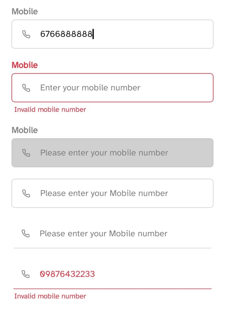
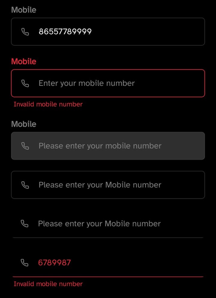
Implementation code
import { UserInput, Icon } from '@nexara/nativeflow';
import { Phone } from 'lucide-react-native';

const Component = () => {
  return (
    <UserInput
      variant='outlined'
      label='Mobile'
      placeholder='Enter your mobile number...'
      helperText='Invalid mobile number'
      isError={false}
      renderLeftIcon={<Icon renderIcon={<Phone color="gray" size={17} />} />}
      onChangeText={(e) => console.log(e)}
    />
  );
};
export default Component;
Props
| Prop | Type | Default | Description |
|---|---|---|---|
variant | "outlined" | "standard" | "standard" | Defines the border style of the input field. |
label | string | Label text displayed above the input. | |
bg | string | theme.colors.inputBgColor | Background color of the input field. |
br | number | 10 | Border radius of the input field. |
stroke | number | 1 | Border width of the input field. |
strokeColor | string | Border color of the input field. | |
labelColor | string | Custom color for the label text. | |
textVariant | { label: string; helperText: string } | { label: 'h5', helperText: 'h6' } | Typography variants for label and helper text. |
inputTextColor | string | Text color inside the input field. | |
cursorColor | string | Cursor color in the input field. | |
placeholderColor | string | Color of the placeholder text. | |
inputFs | number | 13 | Font size of the input text. |
labelFs | number | Font size of the label text. | |
helperTextFS | number | Font size of the helper/error text. | |
placeholder | string | "Please enter..." | Placeholder text shown when input is empty. |
disabled | boolean | false | Disables the input field when true. |
isError | boolean | false | Marks the input as invalid (applies error styles). |
helperText | string | "" | Message shown below the input (error/help). |
multiline | boolean | false | Enables multiline input support. |
renderLeftIcon | JSX.Element | Renders a custom icon on the left side. | |
renderRightIcon | JSX.Element | Renders a custom icon on the right side. | |
styles | { mainContainer?, label?, inputContainer?, input?, helperText? } | Custom styles for different sub-elements. |