Dialog
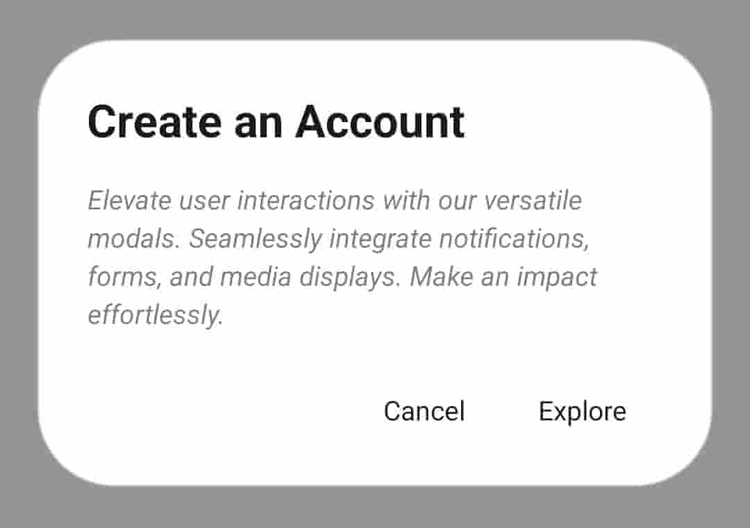
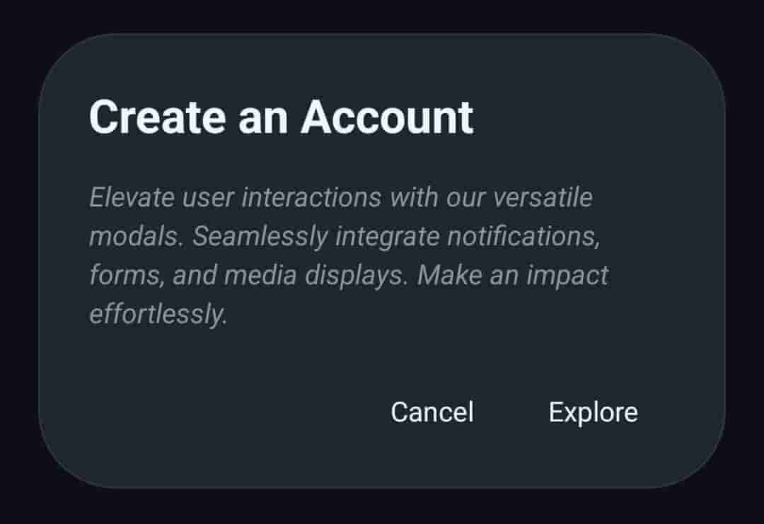
Classic variant
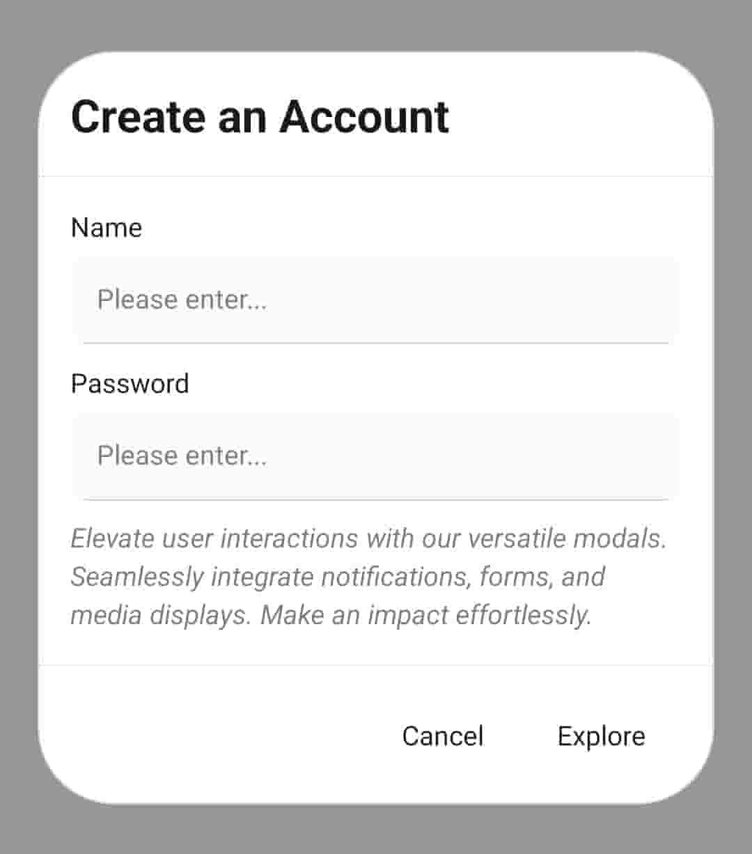
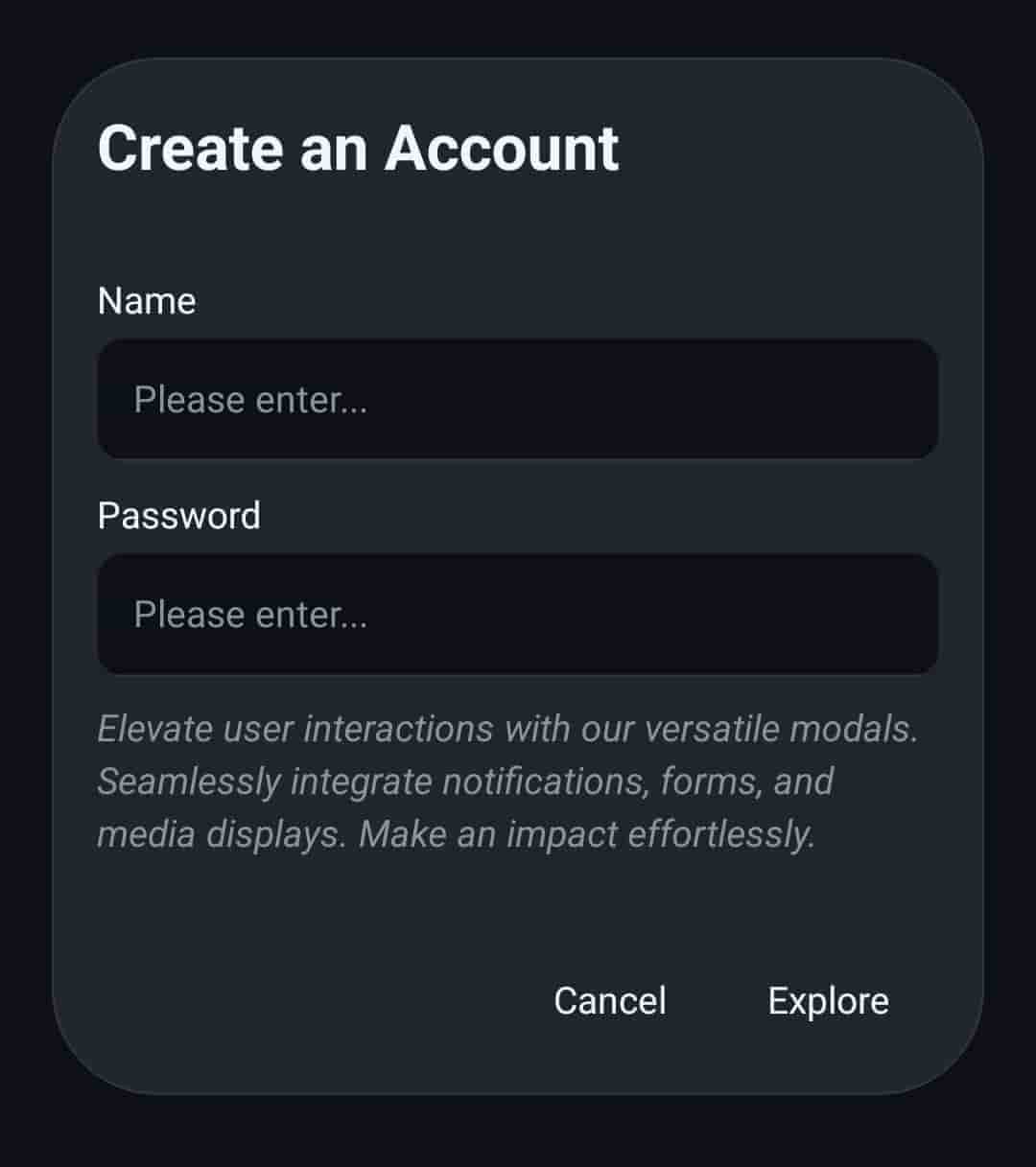
Default variant
Implementation code
Wrap your app.js code with PortalProvider component to use dialog.
import { PortalProvider, NativeProvider } from '@nexara/nativeflow';
import Component from './path';

const App = () => {
    return (
        <NativeProvider>
            <PortalProvider>
                <Component/>
            </PortalProvider>
        </NativeProvider>
    )
}
export default App;
-
Classic variant
import { Dialog, DialogHead, DialogBody, DialogDescription, DialogFoot, Button } from '@nexara/nativeflow';

const Component = () => {

    const dialogRef = useRef<DialogRefProps>(null);

    return (
        <Button
            title='Cancel'
            onPress={()=> dialogRef.current.open()}
        />
        <Dialog ref={dialogRef} size='lg' variant='classic' onClose={() => {}}>
            <DialogHead title='Invite your team' />
            <DialogBody>
                <DialogDescription textStyle={{ fontStyle: 'italic' }}>
                    Elevate user interactions with our versatile modals. Seamlessly integrate notifications, forms, and media displays. Make an impact effortlessly.
                </DialogDescription>
            </DialogBody>
            <DialogFoot>
                <Button
                    variant='outlined'
                    title='Explore'
                    paddingV={10}
                    fScale='sm'
                    stroke={0}
                />
                <Button
                    variant='outlined'
                    title='Explore'
                    paddingV={10}
                    fScale='sm'
                    stroke={0}
                />
            </DialogFoot>
        </Dialog>
    );
}
export default Component;
-
Default variant
import { Dialog, DialogHead, DialogBody, DialogDescription, DialogFoot, Button } from '@nexara/nativeflow';

const Component = () => {

    const dialogRef = useRef<DialogRefProps>(null);

    return (
        <Button
            title='Cancel'
            onPress={()=> dialogRef.current.open()}
        />
        <Dialog ref={dialogRef} onClose={() => {}} >
            <DialogHead title='Contact US' />
            <DialogBody >
                <UserInput
                    label='Name'
                />
                <UserInput
                    label='Email'
                />
                <DialogDescription textStyle={{ fontStyle: 'italic' }}>
                    Elevate user interactions with our versatile modals. Seamlessly integrate notifications, forms, and media displays. Make an impact effortlessly.
                </DialogDescription>
            </DialogBody>
            <DialogFoot>
                <Button
                    variant='outlined'
                    title='Explore'
                    paddingV={10}
                    fScale='sm'
                    stroke={0}
                />
                <Button
                    variant='outlined'
                    title='Explore'
                    paddingV={10}
                    fScale='sm'
                    stroke={0}
                />
            </DialogFoot>
        </Dialog>
    );
}
export default Component;
Props
Dialog Props
| Prop | Type | Default | Description |
|---|---|---|---|
variant | 'classic' | 'default' | 'classic' | Defines the style variant of the dialog. |
size | 'xs' | 'sm' | 'md' | 'lg' | 'full' | 'lg' | Sets the horizontal size of the dialog. |
fullScreen | boolean | false | Makes the dialog cover the entire screen when true. |
backdropColor | string | theme.colors.background.backdrop | Sets the background color of the backdrop. |
onClose | () => void | Callback triggered when the dialog is closed (backdrop press or hardware back button). | |
containerStyle | StyleProp<ViewStyle> | Custom styles for the dialog container. | |
children | ReactNode | Content to be displayed inside the dialog. | |
ref | DialogRefProps | Ref object used to programmatically open or close the dialog (open / close). |
-
Dialog Ref Methods
| Method | Description |
|---|---|
open() | Opens the dialog programmatically |
close() | Closes the dialog programmatically |
Dialog Head Props
| Prop | Type | Default | Description |
|---|---|---|---|
title | string | Title text displayed in the dialog header. If not provided, children will be rendered. | |
fScale | TypographyScale | 'xl' | Typography scale of the title text (e.g., xs, sm, md, lg, xl). |
fs | number | Font size of the title text (overrides fScale if provided). | |
ff | string | Font family of the title text. | |
titleStyle | StyleProp<TextStyle> | Custom styles for the title text. | |
containerStyle | StyleProp<ViewStyle> | Custom styles for the container wrapping the dialog header. | |
children | ReactNode | Additional elements or components rendered inside the dialog header, used if title is not provided. |
Dialog Body Props
| Prop | Type | Default | Description |
|---|---|---|---|
scrollEnable | boolean | true | Enables or disables scrolling when content overflows from the parent. |
containerStyle | StyleProp<ViewStyle> | Custom styles for the dialog body container. | |
children | ReactNode | Content to be rendered inside the dialog body. |
Dialog Description Props
| Prop | Type | Default | Description |
|---|---|---|---|
fScale | TypographyScale | 'sm' | Typography scale applied to the description text. |
fs | number | Font size of the description text (overrides fScale if provided). | |
containerStyle | StyleProp<ViewStyle> | Custom styles for the container wrapping the dialog description. | |
textStyle | StyleProp<TextStyle> | Custom styles for the description text itself. | |
children | ReactNode | Content to be rendered inside the dialog description. |
Dialog Foot Props
| Prop | Type | Default | Description |
|---|---|---|---|
containerStyle | StyleProp<ViewStyle> | Custom styles for the container wrapping the dialog footer. | |
children | ReactNode | Content to be rendered inside the dialog footer. |