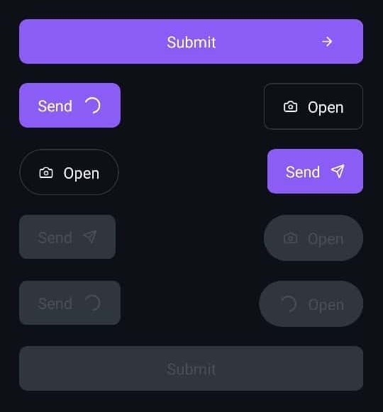
Button
Button components render a pre-styled button that can be easily customized using props.

Implementation Code
import { Button, Icon } from '@nexara/nativeflow';
import { ArrowRight } from 'lucide-react-native';

const Component = () => {
  return (
    <Button
      title='Open'
      fullWidth
      renderRightIcon={<Icon renderIcon={<ArrowRight size={17} color='white' />} />}
      onPress={() => console.log('Button clicked!')}
    />
  );
};

export default Component;
Props
| Prop | Type | Default | Description |
|---|---|---|---|
variant | contained | outlined | 'contained' | Specifies the button style variant. |
type | 'round' | 'flat' | 'flat' | Determines the button shape. |
fullWidth | boolean | false | Expands the button to occupy the full width. |
paddingH | number | 30 (if fullWidth is true) / 20 (otherwise) | Horizontal padding inside the button. |
paddingV | number | 12 | Vertical padding inside the button. |
bg | string | theme.colors.brand.primary | Custom background color (for contained buttons). |
br | number | 5 | Border radius of the button. |
stroke | number | 1 | Border width (for outlined variant). |
strokeColor | string | theme.colors.brand.primary | Border color (for outlined variant). |
title | string | 'Button' | Text (label) displayed on the button. |
titleColor | string | #000 | Color of the button text. |
fs | number | 14 | Font size of the button text. |
fScale | TypographyScale | 'base' | Typography scale for the button text. |
size | number | 50 | Button size (applies when type="round"). |
rippleColor | string | theme.colors.states.pressed | Ripple effect color on press. |
renderIcon | JSX.Element | Single icon placed at the center (mostly for round buttons). | |
renderLeftIcon | JSX.Element | Icon displayed before the button text. | |
renderRightIcon | JSX.Element | Icon displayed after the button text. | |
disabled | boolean | false | Disables the button when true. |
loading | boolean | false | Shows a loading indicator and disables interaction when true. |
containerStyle | StyleProp<ViewStyle> | Custom styles for the button container. | |
titleStyle | StyleProp<TextStyle> | Custom styles for the button text. | |
onPress | () => void | Function to execute when the button is pressed. |