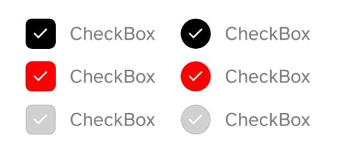
Check Box
Check Box component render a pre-styled checkbox that can easily be re-style by using props.
Implementation code
- Internally controlled checkbox
import { CheckBox } from '@nexara/nativeflow';

const Component = () => {
  return (
    <CheckBox
      label='CheckBox'
      defaultValue={true}
      onPress={(e)=>console.log(e)}
    />
  );
}
export default Component;
- Externally controlled checkbox
import {useState} from 'react';
import { CheckBox } from '@nexara/nativeflow';

const Component = () => {

  const [value, setValue] = useState(false);

  return (
    <CheckBox
      label='CheckBox'
      disableBuiltInState
      isChecked={value}
      onPress={(e)=>setValue(e)}
    />
  );
}
export default Component;
Props
| Prop | Type | Default | Description |
|---|---|---|---|
variant | square | round | square | Shape of the checkbox. |
isChecked | boolean | false | Controls the checked state when disableBuiltInState=true. |
defaultValue | boolean | false | Sets the initial checked state when disableBuiltInState=false. |
activeBgColor | string | Background color of the checkbox when checked. | |
inActiveBgColor | string | 'transparent' | Background color of the checkbox when unchecked. |
iconColor | string | Color of the checkmark icon. | |
disableBuiltInState | boolean | false | Disables internal state handling. Use isChecked to control state. |
disabled | boolean | false | Disables the checkbox and prevents user interaction. |
label | string | 'Checkbox' | Text displayed to the right of the checkbox. |
size | number | 22 | Width and height of the checkbox. |
iconSize | number | size / 1.5 | Size of the checkmark icon. Defaults relative to size if not provided. |
containerStyle | ViewStyle | Custom styles for the outer container (checkbox + label). | |
checkBoxStyle | ViewStyle | Custom styles for the checkbox itself. | |
labelStyle | TextStyle | Custom styles for the label text. | |
onPress | (checked: boolean) => void | Callback triggered when the checkbox is pressed, returning the new checked state. |