Switch
⚠️ Experimental Component
This component is still being evaluated and may change in future releases.
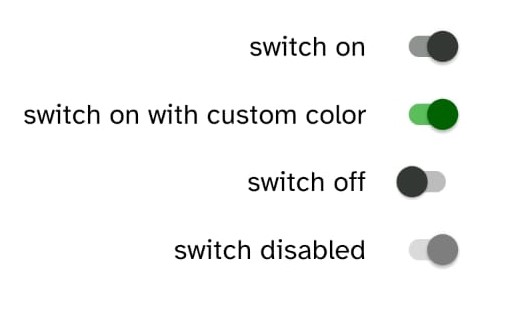
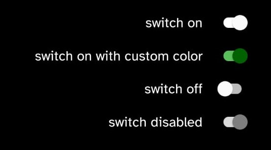
Switch components render a pre-styled switch that can easily be re-style by using props.
Implementation code
import { Switch } from '@nexara/nativeflow';

const Component = () => {
  return (
    <Switch
        checked={true}
        size={0.8}
        color='#000000'
        onChange={(e) => console.log(e)}
    />
  );
}
export default Component;
Props
| Prop | Type | Default | Description |
|---|---|---|---|
checked | boolean | true | Indicates whether the switch is on (true) or off (false). |
color | string | Sets the color of the switch thumb. | |
disabled | boolean | false | Disables the switch if set to true. |
size | number | 0.8 | Scales the size of the switch using a multiplier. |
activeTrackColor | string | Color of the track when the switch is checked. | |
inactiveTrackColor | string | Color of the track when the switch is not checked. | |
onChange | function | Callback function that is fired when the switch value changes. |