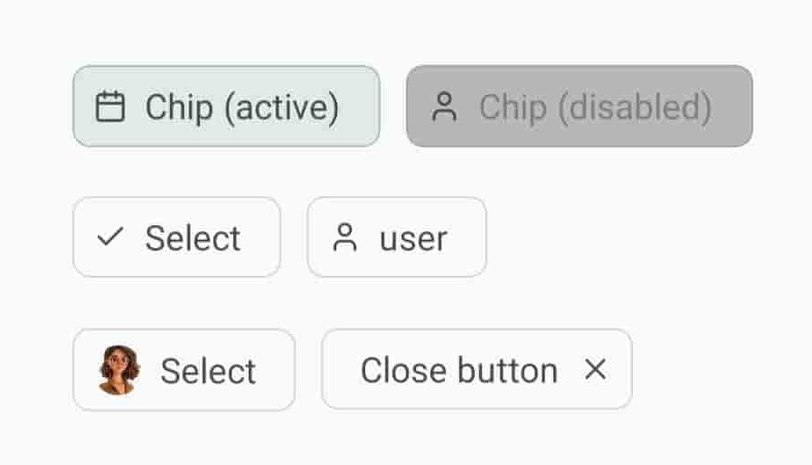
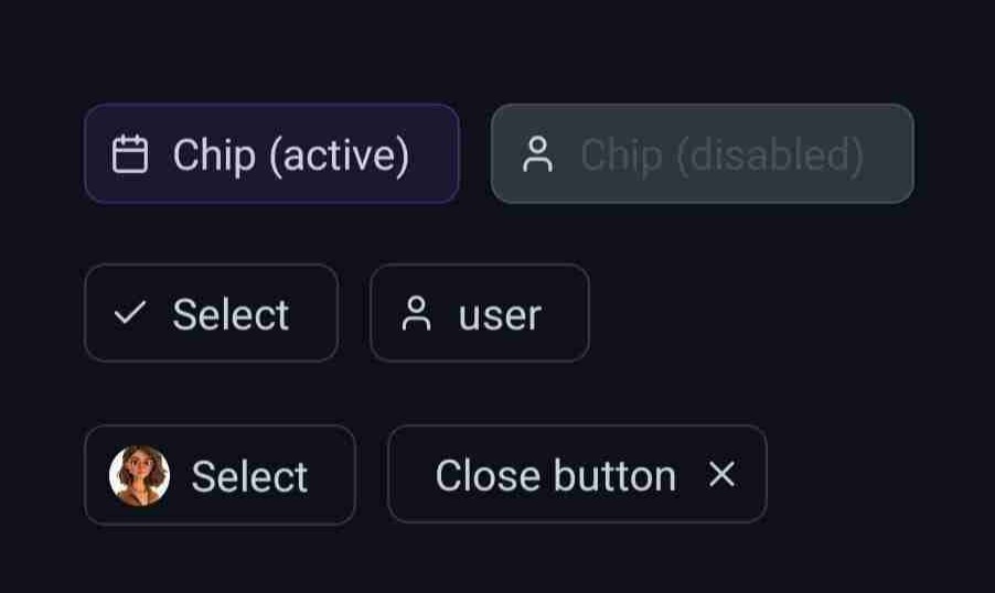
Chip
Chip component renders a compact, customizable element that can display text and optional icons, often used for tags, categories, or selectable items.
Implementation code
import { Chip } from '@nexara/nativeflow';
import { Camera } from 'lucide-react-native';

const Component = () => {
  return (
        <Chip renderLeftIcon={<Camera color='#000' size={14} />} />
    );
}
export default Component;
Props
| Prop | Type | Default | Description |
|---|---|---|---|
label | string | 'Chip' | Text displayed inside the chip. |
bg | string | Background color of the chip. | |
labelColor | string | Color of the label text. | |
fs | number | Font size of the label text (overrides fScale if provided). | |
fScale | TypographyScale | 'sm' | Typography scale of the label text. |
ff | string | Font family for the label text. | |
br | number | 7 | Border radius of the chip. |
gap | number | 7 | Spacing between elements inside the chip. |
paddingV | number | 6 | Vertical padding inside the chip. |
paddingH | number | 15 | Horizontal padding inside the chip. |
stroke | number | 0.8 | Border width of the chip. |
strokeColor | string | Border color of the chip. | |
rippleColor | string | Ripple effect color when pressed. | |
disabled | boolean | false | Disables the chip, preventing interaction. |
active | boolean | false | Indicates the chip is active (for styling purposes). |
renderLeftIcon | JSX.Element | Icon element to render on the left side of the chip. | |
renderRightIcon | JSX.Element | Icon element to render on the right side of the chip. | |
containerStyle | StyleProp<ViewStyle> | Custom styles for the chip container. | |
textStyle | StyleProp<TextStyle> | Custom styles for the label text. | |
onPress | () => void | Function executed when the chip is pressed. |