StyledText
StyledText component renders text with customizable font size, weight, family, color, and alignment, adapting dynamically to screen size and theme.
Implementation
import { StyledView, StyledText } from '@nexara/nativeflow';

const Component = () => {
  return (
    <StyledView f={1}>
        <StyledText>Here is your text...</StyledText>
    </StyledView>
  );
};
export default Component;
Props
| Prop | Type | Default | Description |
|---|---|---|---|
variant | TypographyVariant | Determines the typography variant and default text color. | |
fScale | TypographyScale | 'base' | Sets the font size using the theme's responsive typography scale. |
ff | string | Sets the font family. | |
fs | number | Manually overrides the font size. | |
fw | TextStyle['fontWeight'] | 'normal' | Sets the font weight. |
tas | boolean | false | If true, centers the text horizontally (textAlign: center). |
color | Directly sets the text color, overriding variant and themeColor. | ||
themeColor | boolean | If true, applies the theme’s primary color. | |
children | React.ReactNode | Content to be rendered inside the text. | |
style | StyleProp<TextStyle> | Additional custom styles to apply to the text. |
-
variant (fScale)
| Variant | Description |
|---|---|
primary | Default text color for standard content |
secondary | Secondary text color, usually less prominent |
tertiary | Tertiary text color, used for hints or info |
disabled | Color for disabled or inactive text |
inverse | Color for text over dark backgrounds |
-
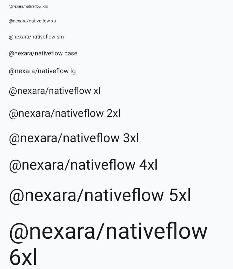
Font Scale (fScale)
| Scale | Font Size (px) |
|---|---|
xxs | 10 |
xs | 12 |
sm | 14 |
base | 16 |
lg | 18 |
xl | 24 |
2xl | 28 |
3xl | 32 |
4xl | 36 |
5xl | 45 |
6xl | 57 |